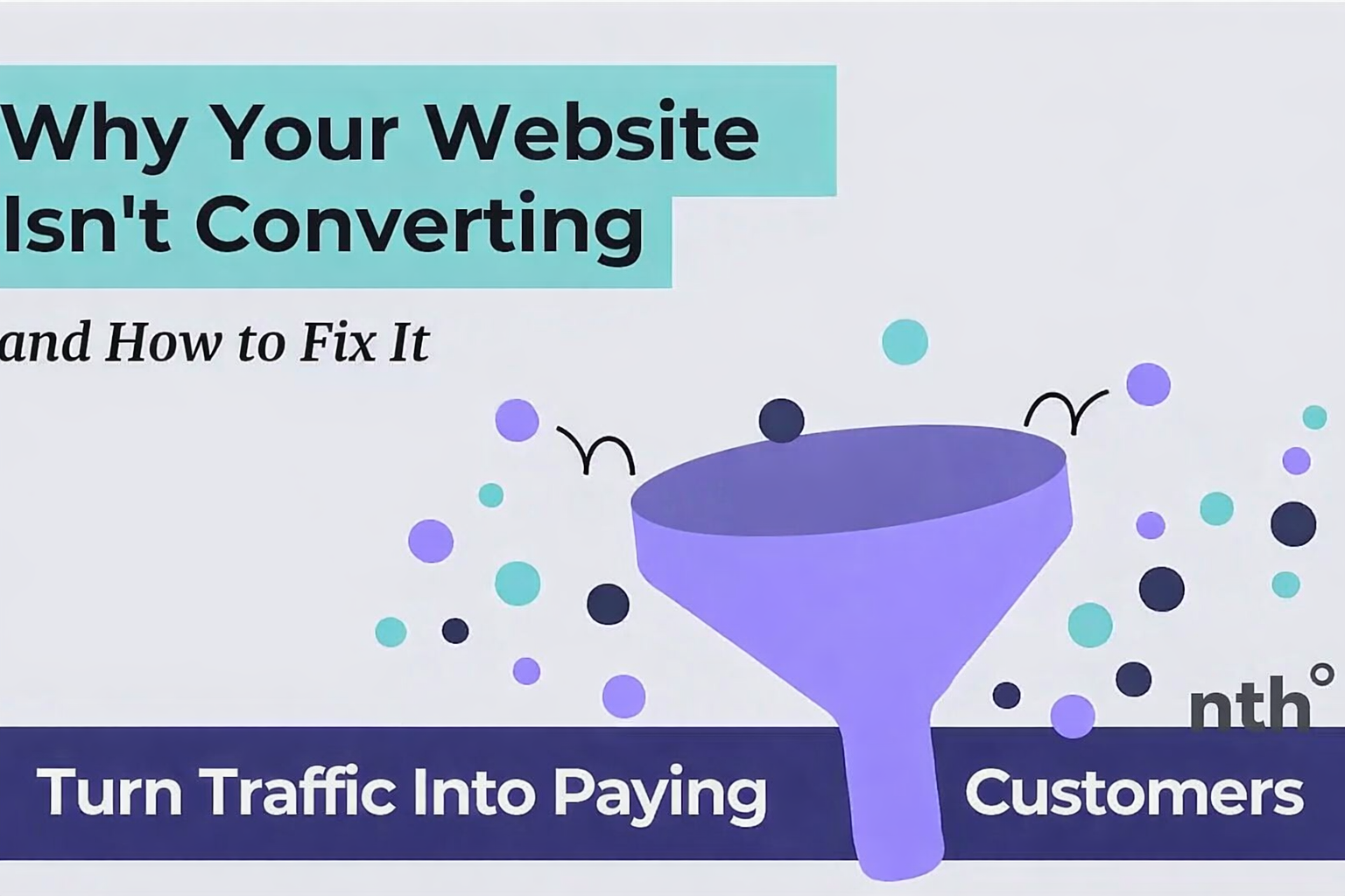
Why Your Website Isn't Converting (And How to Fix It)
Discover the 7 most common reasons startup websites fail to convert visitors into customers. Learn actionable fixes you can implement today to improve your conversion rate.
Why Your Website Isn't Converting (And How to Fix It)
TL;DR: If your website gets traffic but few conversions, the problem is usually one of 7 things: unclear messaging, slow load times, weak CTAs, missing trust signals, friction in the signup flow, poor mobile experience, or targeting the wrong audience. This guide shows you how to diagnose and fix each issue.
You're getting traffic. People are landing on your site. But they're not signing up, buying, or even clicking your CTA.
Sound familiar?
The average website conversion rate is 2-3%. But many startup websites convert at less than 1%. That means for every 100 visitors, 99+ leave without taking action.
The good news? Most conversion killers are fixable in a weekend.
Let's diagnose your problem.
Table of Contents
- How to Diagnose Your Conversion Problem
- Reason #1: Unclear Value Proposition
- Reason #2: Slow Page Load Speed
- Reason #3: Weak or Hidden CTAs
- Reason #4: No Trust Signals
- Reason #5: Too Much Friction
- Reason #6: Poor Mobile Experience
- Reason #7: Wrong Traffic
- Quick Conversion Audit Checklist
- How to Prioritize Fixes
How to Diagnose Your Conversion Problem
Before fixing anything, you need to understand where visitors drop off.
Check These Metrics First
- Bounce rate - Are visitors leaving immediately? (High bounce = messaging problem)
- Time on page - Are visitors reading or scanning and leaving? (Low time = content problem)
- Scroll depth - How far down the page do visitors go? (Low scroll = weak hook)
- CTA click rate - Are visitors clicking your buttons? (Low clicks = CTA problem)
- Form abandonment - Are visitors starting but not finishing forms? (High abandonment = friction problem)
Tools for Diagnosis
- Google Analytics 4 - Traffic, bounce rate, conversions
- Hotjar/Microsoft Clarity - Heatmaps, session recordings
- Google Search Console - What queries bring traffic
- BrandProbe - Full website audit in 60 seconds
Now let's fix your conversion killers.
Reason #1: Unclear Value Proposition
The symptom: High bounce rate (60%+), visitors leave within 5 seconds.
The problem: Visitors can't figure out what you do or why they should care.
Signs You Have This Problem
- Your headline uses jargon or buzzwords
- You lead with features instead of benefits
- There's no clear target audience
- Visitors have to scroll to understand your product
How to Fix It
Step 1: Rewrite your headline using this formula:
[Action verb] + [Outcome] + [For whom] + [Timeframe/Method]
Bad examples:
- "Revolutionizing the future of work" ❌
- "AI-powered platform for businesses" ❌
- "The world's best [category]" ❌
Good examples:
- "Get cited by ChatGPT in 30 days" ✅
- "Website audits that tell you what to fix this week" ✅
- "Turn website visitors into customers without hiring a dev" ✅
Step 2: Add a subheadline that explains HOW:
Your headline is the WHAT. Your subheadline is the HOW.
Example:
- Headline: "Turn website visitors into customers"
- Subheadline: "AI analyzes your site in 60 seconds and tells you exactly what's killing conversions"
Step 3: Show, don't tell:
Add a screenshot, demo video, or animated GIF showing your product in action. Visitors should understand your product visually, not just through text.
Impact
Fixing your value proposition alone can double your conversion rate. It's the highest-impact change you can make.
Reason #2: Slow Page Load Speed
The symptom: Visitors leave before the page finishes loading.
The problem: Every second of load time costs you conversions.
The Data
- 1 second delay = 7% drop in conversions
- 3+ second load time = 53% of mobile visitors bounce
- Google penalizes slow sites in rankings
How to Test
- Run Google PageSpeed Insights
- Check your Core Web Vitals
- Test on mobile with 3G connection
How to Fix It
Quick wins (do today):
- Compress images - Use TinyPNG or convert to WebP
- Enable lazy loading - Add
loading="lazy"to images below the fold - Remove unused JavaScript - Audit your third-party scripts
- Use a CDN - Cloudflare (free) or Vercel Edge Network
Medium effort:
- Defer non-critical JavaScript - Load analytics and chat widgets after page load
- Preload critical assets - Fonts, hero images
- Enable caching - Set cache headers for static assets
Target metrics:
- Load time: Under 2 seconds
- LCP (Largest Contentful Paint): Under 2.5 seconds
- CLS (Cumulative Layout Shift): Under 0.1
Impact
A 1-second improvement in load time can increase conversions by 10-20%.
Reason #3: Weak or Hidden CTAs
The symptom: Good time on page, but low CTA click rate.
The problem: Visitors don't know what to do next, or the CTA doesn't motivate action.
Signs You Have This Problem
- Your CTA says "Submit" or "Learn More"
- The button blends into the page
- There's only one CTA at the bottom
- You have too many competing CTAs
How to Fix It
Step 1: Use action-oriented button text:
❌ Weak CTAs:
- "Submit"
- "Learn More"
- "Click Here"
- "Get Started"
✅ Strong CTAs:
- "Get My Free Audit"
- "Start Converting Today"
- "See My Website Score"
- "Unlock Full Report"
Step 2: Make your CTA visually dominant:
- Use a contrasting color (your brand's accent color)
- Make the button large enough to tap on mobile (minimum 44px height)
- Add whitespace around the button
- Use only ONE primary CTA per screen
Step 3: Repeat CTAs on long pages:
Rule of thumb: Every 2-3 scroll depths (600-800px), add another CTA opportunity.
Step 4: Add urgency or specificity:
- "Start your free 14-day trial" > "Start free trial"
- "Get your audit in 60 seconds" > "Get audit"
- "Join 500+ founders" > "Sign up"
Impact
Improving CTA copy and placement can increase click-through rates by 30-50%.
Reason #4: No Trust Signals
The symptom: Visitors click around but don't convert. Cart abandonment is high.
The problem: Visitors don't trust you enough to give their email or credit card.
Signs You Have This Problem
- No testimonials or reviews visible
- No customer logos
- No social proof numbers
- No security badges on forms
- No clear refund/guarantee policy
How to Fix It
Step 1: Add social proof above the fold:
- "Trusted by 500+ startups"
- Customer logos (even 3-4 helps)
- Star ratings with review count
- Real testimonial with name and photo
Step 2: Use specific numbers:
❌ "Thousands of happy customers" ✅ "2,847 websites analyzed this month"
❌ "Highly rated" ✅ "4.8/5 from 127 reviews"
Step 3: Add trust badges near conversion points:
- SSL/security badge on checkout
- "30-day money-back guarantee"
- Payment provider logos (Stripe, PayPal)
- "No credit card required" for free trials
Step 4: Show real testimonials:
Best format:
"Specific result they achieved" - Full Name, Role at Company
Example:
"BrandProbe found 3 messaging issues I'd missed for months. Fixed them and saw 40% more demo requests." - Sarah Chen, Founder at Acme SaaS
Impact
Adding testimonials can increase conversions by 34%. Trust badges near CTAs can boost conversions by 15-20%.
Reason #5: Too Much Friction
The symptom: High form abandonment rate. Visitors start but don't finish signing up.
The problem: Your signup flow asks for too much, too soon.
Signs You Have This Problem
- Signup form has 5+ fields
- You require credit card for free trial
- You require phone number
- There are multiple steps before value
- No progress indicator on multi-step forms
How to Fix It
Step 1: Minimize form fields:
Ideal free trial form:
- Email only (best)
- Email + Name (good)
- Email + Name + Company (acceptable)
Every field you remove can increase completion by 10%.
Step 2: Remove credit card requirement:
"No credit card required" increases free trial signups by 30-50%.
Step 3: Delay asks until after value:
Don't ask for company size, role, or phone number until after they've experienced value.
Step 4: Use progressive profiling:
Collect additional data over time through in-app prompts, not upfront forms.
Step 5: Add social login:
"Sign up with Google" reduces friction significantly. One click > filling out a form.
Impact
Reducing form fields from 6 to 3 can increase conversions by 25-50%.
Reason #6: Poor Mobile Experience
The symptom: Mobile conversion rate is 50%+ lower than desktop.
The problem: Your site looks great on desktop but breaks on mobile.
The Data
- 60%+ of traffic is mobile for most startups
- Mobile conversion rates are typically half of desktop
- But mobile users convert IF the experience is good
Signs You Have This Problem
- Text is too small to read on mobile
- Buttons are too small to tap
- Horizontal scrolling required
- Forms are impossible to fill out
- Page takes forever to load on mobile
How to Fix It
Step 1: Test on real devices:
Don't just use browser dev tools. Test on actual phones:
- iPhone (Safari)
- Android (Chrome)
- Different screen sizes
Step 2: Fix tap targets:
- Minimum button size: 44x44 pixels
- Minimum link spacing: 8px between tappable elements
Step 3: Simplify mobile navigation:
- Use hamburger menu for secondary links
- Keep primary CTA always visible
- Reduce content on mobile (progressive disclosure)
Step 4: Optimize mobile forms:
- Use appropriate input types (
type="email",type="tel") - Enable autocomplete
- Make fields full-width
- Use large font size (16px minimum to prevent zoom)
Step 5: Speed up mobile load time:
- Compress images aggressively for mobile
- Lazy load everything below the fold
- Consider AMP for blog content
Impact
Improving mobile experience can increase overall conversions by 20-40% (since mobile is 60%+ of traffic).
Reason #7: Wrong Traffic
The symptom: Good engagement metrics but low conversion. Visitors read content but don't convert.
The problem: You're attracting visitors who aren't your target customers.
Signs You Have This Problem
- High traffic, low conversions
- Visitors bounce from pricing page
- Free users never upgrade
- Blog traffic doesn't convert to signups
- Ads have high CTR but low conversion
How to Fix It
Step 1: Check your traffic sources:
In Google Analytics, compare conversion rates by:
- Channel (organic, paid, social, referral)
- Landing page
- Geography
- Device
Identify which sources bring converting traffic vs. just any traffic.
Step 2: Audit your content strategy:
Are you creating content for:
- People who will buy? ✅
- People just looking for free info? ❌
Example:
- "Best CRM for sales teams" = buying intent ✅
- "What is CRM?" = educational, low intent ⚠️
Step 3: Refine your targeting:
For paid ads:
- Narrow audience to job titles that match your buyers
- Exclude irrelevant interests
- Use lookalike audiences based on paying customers
For SEO:
- Target keywords with buying intent
- Create content for your ideal customer, not everyone
Step 4: Pre-qualify on landing pages:
Make it clear who your product is for:
- "Built for B2B SaaS founders with 1-50 employees"
- "For marketing teams spending $10K+/month on ads"
This reduces unqualified traffic but increases conversion rate.
Impact
Better traffic quality can double or triple conversion rates, even without changing your website.
Quick Conversion Audit Checklist
Use this checklist to quickly audit your website:
Value Proposition
- Can a stranger understand what you do in 5 seconds?
- Is your target audience clear?
- Do you lead with benefits, not features?
Page Speed
- Does your page load in under 3 seconds?
- Are images compressed and lazy-loaded?
- Do you pass Core Web Vitals?
CTAs
- Is your primary CTA above the fold?
- Does your button text describe the outcome?
- Do you repeat CTAs on long pages?
Trust
- Do you have testimonials visible?
- Do you show customer logos or numbers?
- Are trust badges near conversion points?
Friction
- Is your signup form 3 fields or less?
- Is credit card required for free trials?
- Can users sign up with Google/social?
Mobile
- Have you tested on real mobile devices?
- Are buttons/links easy to tap?
- Does mobile load quickly?
Traffic
- Do you know which traffic sources convert best?
- Is your content attracting buyers, not browsers?
- Are you clear about who your product is for?
How to Prioritize Fixes
You can't fix everything at once. Use this prioritization framework:
Priority 1: High Impact, Low Effort (Do First)
- Rewrite headline/value proposition
- Improve CTA button text
- Add testimonials above the fold
- Remove unnecessary form fields
Priority 2: High Impact, High Effort (Schedule Next)
- Improve page speed
- Redesign mobile experience
- Add social login
Priority 3: Medium Impact (Do When You Have Time)
- Add more trust badges
- Optimize for better traffic
- A/B test variations
Priority 4: Low Priority (Nice to Have)
- Exit intent popups
- Live chat widget
- Advanced personalization
Key Takeaways
- Diagnose first - Check your metrics before making changes
- Clarity wins - Unclear messaging is the #1 conversion killer
- Speed matters - Every second costs you conversions
- Reduce friction - Fewer form fields = more signups
- Build trust - Social proof increases conversions by 30%+
- Mobile is critical - 60% of your traffic is probably mobile
- Quality > quantity - Better to have fewer, converting visitors
Frequently Asked Questions
What's a good website conversion rate?
The average is 2-3%, but this varies by industry. SaaS free trial conversions typically range from 2-5%. E-commerce ranges from 1-4%. Aim to be above your industry average, then optimize from there.
How long does it take to see results from conversion optimization?
Quick fixes (headline, CTA, testimonials) can show results within days if you have traffic. Larger changes (page speed, mobile redesign) may take 2-4 weeks to implement and measure.
Should I A/B test everything?
Only if you have enough traffic. You need ~1,000 visitors per variation for statistical significance. If you have low traffic, make directional changes based on best practices first.
What's the fastest way to improve conversions?
Fix your value proposition. If visitors don't immediately understand what you do and why it matters to them, nothing else matters. This is consistently the highest-impact change.
How do I know which problem I have?
Look at where visitors drop off. High bounce rate = messaging problem. Low CTA clicks = CTA problem. High form abandonment = friction problem. Low mobile conversion = mobile problem.
Ready to Find Your Conversion Killers?
Manually auditing your website takes hours. BrandProbe does it in 60 seconds.
Get instant analysis of:
- ✅ Messaging clarity score
- ✅ Conversion optimization issues
- ✅ Technical performance problems
- ✅ Mobile experience audit
- ✅ Trust signal assessment
- ✅ Specific fixes prioritized by impact
Sources:
Tags:
Share this article:
Ready to optimize your website?
Get a free AI-powered analysis of your website in 60 seconds.
Analyze Your Website →