5 Signs Your Website Messaging is Confusing Visitors (And Costing You Customers)
Is your website messaging driving visitors away? Learn the 5 telltale signs of confusing messaging and how to fix them for better conversions.
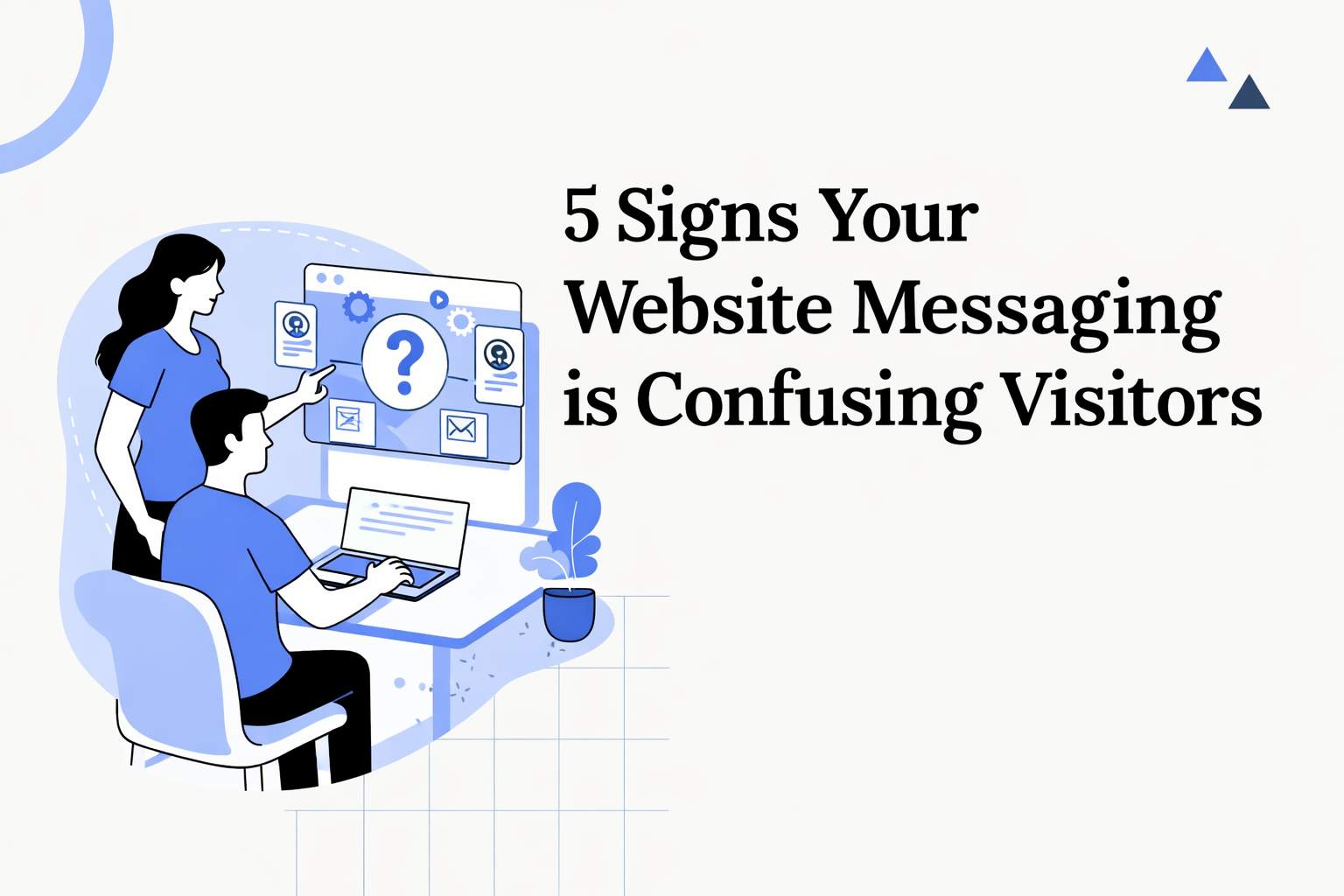
5 Signs Your Website Messaging is Confusing Visitors (And Costing You Customers)
TL;DR: Confusing messaging is the silent killer of conversions. If visitors can't understand what you do in 5 seconds, they leave. This guide reveals the 5 warning signs of bad messaging and gives you templates to fix each one.
Here's a brutal truth: Most startup websites fail the "5 second test."
A stranger lands on your site. They look at the headline, subheadline, maybe the hero image. In 5 seconds, they decide: "Is this for me?"
If your messaging is confusing, the answer is always "I don't know, so I'll leave."
That's not a traffic problem. That's a messaging problem.
Let's find out if you have one.
The 5 Second Test
Before diving into the signs, try this:
- Open your website
- Show it to someone who doesn't know your product
- After 5 seconds, hide it
- Ask them: "What does this company do? Who is it for?"
If they can't answer clearly, your messaging needs work.
Sign #1: Your Headline Uses Buzzwords Instead of Benefits
The Problem
Your headline says something like:
- "The AI-Powered Platform for Modern Teams"
- "Revolutionizing How You Work"
- "Next-Gen Solutions for Digital Transformation"
- "Unlock Your Full Potential"
These headlines say nothing. They could apply to literally any product in any industry.
Why It Happens
Founders think abstract, impressive-sounding language makes their product seem bigger. It doesn't. It makes it forgettable.
How to Fix It
Replace buzzwords with specific outcomes.
Formula:
[Action] + [Outcome] + [For whom]
Bad: "AI-Powered Platform for Modern Teams"
Good examples:
- "Get website feedback in 60 seconds" (BrandProbe)
- "Send emails that land in inboxes, not spam" (specific outcome)
- "Track time without opening another app" (specific outcome)
- "Hire developers in 48 hours, not 48 days" (specific outcome + timeframe)
The best headlines are boring but clear. "We help X do Y" beats "Revolutionary platform" every time.
Sign #2: Visitors Have to Scroll to Understand What You Do
The Problem
Your "above the fold" content (what visitors see before scrolling) doesn't explain your product. The explanation is buried in:
- A feature section halfway down the page
- An "About" page
- A video they need to click play on
- A wall of text that requires reading
Why It Happens
Founders assume visitors will explore the site to understand. They won't. Studies show most visitors decide in 2-5 seconds whether to stay.
How to Fix It
Your above-the-fold content must include:
- Clear headline - What you do
- Subheadline - How you do it / who it's for
- Visual proof - Screenshot, demo, or result
- CTA - What to do next
Example structure:
Headline: "Find out why your website isn't converting"
Subheadline: "Paste your URL. Get a brutally honest audit in 60 seconds covering messaging, SEO, AI visibility, and 7 more categories."
Visual: Screenshot of the report
CTA: "Get Free Audit"
No scrolling required to understand the product.
Sign #3: You Lead with Features Instead of Problems/Outcomes
The Problem
Your homepage reads like a spec sheet:
- "Built with AI technology"
- "Cloud-native architecture"
- "50+ integrations"
- "Real-time analytics dashboard"
- "SOC 2 compliant"
Features tell people WHAT your product has. They don't tell people WHY they should care.
Why It Happens
Founders are proud of what they built. They spent months on these features. But visitors don't care about features - they care about solving their problem.
How to Fix It
Lead with the problem or outcome. Mention features second.
Feature-first (bad):
"AI-powered website analyzer with 10 audit categories"
Problem-first (good):
"Know exactly why your website isn't converting. Our AI analyzes 10 categories in 60 seconds."
Feature-first (bad):
"50+ integrations with your favorite tools"
Outcome-first (good):
"Connect your entire stack in 5 minutes - works with Slack, Notion, Salesforce, and 50+ more"
The formula:
[Problem/Outcome] → [Feature that enables it]
Not:
[Feature] → (hope visitors figure out why it matters)
Sign #4: Your Target Audience is "Everyone"
The Problem
Your site doesn't clearly state who it's for. Or it tries to appeal to everyone:
- "For businesses of all sizes"
- "Perfect for teams and individuals"
- "Whether you're a startup or enterprise"
When you try to speak to everyone, you connect with no one.
Why It Happens
Founders fear narrowing their audience will limit their market. In reality, the opposite happens - specific messaging converts better and you can expand later.
How to Fix It
Call out your target audience explicitly.
Add phrases like:
- "Built for early-stage startups"
- "For SaaS founders who..."
- "If you're a marketing team spending $10K+/month on ads..."
- "Designed for solo developers"
Example - Generic:
"The best way to manage your projects"
Example - Specific:
"Project management for agencies juggling 10+ client accounts"
The specific version will convert better for agencies AND will still attract non-agencies who relate to the complexity.
Specificity signals expertise. "We built this for people exactly like you" beats "We built this for anyone."
Sign #5: Your Subheadline Doesn't Add New Information
The Problem
Your headline and subheadline say the same thing in different words:
Headline: "The Best Project Management Tool"
Subheadline: "Manage your projects better than ever before"
The subheadline wasted valuable real estate repeating the headline.
Why It Happens
People treat subheadlines as an afterthought. Or they think the subheadline should just "support" the headline.
How to Fix It
Your headline = WHAT. Your subheadline = HOW or FOR WHOM.
Bad:
Headline: "Website Audits Made Easy"
Subheadline: "Get easy website audits for your business"
Good:
Headline: "Find out why your website isn't converting"
Subheadline: "Paste your URL. Get AI-powered insights on messaging, SEO, and conversions in 60 seconds."
The subheadline adds:
- How it works (paste URL, AI-powered)
- What you get (insights on messaging, SEO, conversions)
- How fast (60 seconds)
Another example:
Bad:
Headline: "Email Marketing for Modern Teams"
Subheadline: "The modern way to do email marketing"
Good:
Headline: "Email Marketing for Modern Teams"
Subheadline: "Send personalized emails to 10,000 subscribers. No coding, no designers. Just connect your data and hit send."
Quick Messaging Audit
Rate your website 1-5 on each:
| Criteria | 1 (Bad) | 5 (Good) |
|---|---|---|
| Headline clarity | Uses buzzwords | States specific outcome |
| Above-the-fold | Need to scroll to understand | Clear in 5 seconds |
| Problem/outcome focus | Lists features first | Leads with user benefit |
| Target audience | "For everyone" | Specific persona called out |
| Subheadline value | Repeats headline | Adds how/for whom |
Score:
- 20-25: Great messaging foundation
- 15-19: Some work needed
- Below 15: Messaging overhaul needed
Messaging Templates That Convert
Use these templates to rewrite your messaging:
Template 1: The Problem-Solution Headline
[Specific problem] → [Your solution]
Examples:
- "Tired of website feedback that's vague? Get specific fixes in 60 seconds."
- "Stop guessing why visitors don't convert. Get data-backed answers."
Template 2: The Result Headline
[Desired outcome] + [Timeframe or method]
Examples:
- "Know exactly what's killing your conversions in under a minute"
- "Get cited by ChatGPT in 30 days"
Template 3: The "For X Who Y" Headline
[Product type] for [Audience] who [Situation/Problem]
Examples:
- "Website audits for founders who don't have time to guess"
- "Email marketing for teams who hate complex tools"
Template 4: The Anti-Buzzword Headline
[Simple description of what you actually do]
Examples:
- "We analyze your website and tell you what to fix"
- "We help you send better emails"
- "We find bugs before your users do"
Sometimes the most effective headline is just... direct.
Before and After Examples
Example 1: B2B SaaS
Before:
"The Future of Work is Here"
"Revolutionize your workflow with our AI-powered platform"
After:
"Cut meeting time in half"
"AI summarizes your meetings and creates action items automatically. No more note-taking."
Example 2: Developer Tool
Before:
"Next-Gen Development Platform"
"Build faster with modern technology"
After:
"Deploy to production in 30 seconds"
"Connect your GitHub repo. We handle servers, scaling, and SSL. You ship code."
Example 3: Marketing Tool
Before:
"All-in-One Marketing Suite"
"Everything you need to grow your business"
After:
"Know why your website isn't converting"
"Paste your URL. Get a brutally honest audit covering messaging, SEO, and 8 more categories in 60 seconds."
Key Takeaways
- 5 second rule - If visitors can't understand you in 5 seconds, they leave
- Buzzwords kill conversions - Be specific, even if it feels boring
- Above the fold matters most - Don't make people scroll to understand
- Problems beat features - Lead with what users get, not what you built
- Specific beats generic - "For X who Y" converts better than "For everyone"
- Subheadlines add info - They should explain HOW, not repeat WHAT
Ready to Fix Your Messaging?
Not sure if your messaging is clear enough? BrandProbe analyzes your website's messaging clarity in 60 seconds.
Get scored on:
- ✅ Headline clarity
- ✅ Value proposition strength
- ✅ Target audience clarity
- ✅ Problem/solution framing
- ✅ Specific fixes to improve
Get Your Free Messaging Audit →
Sources:
Tags:
Share this article:
Ready to optimize your website?
Get a free AI-powered analysis of your website in 60 seconds.
Analyze Your Website →